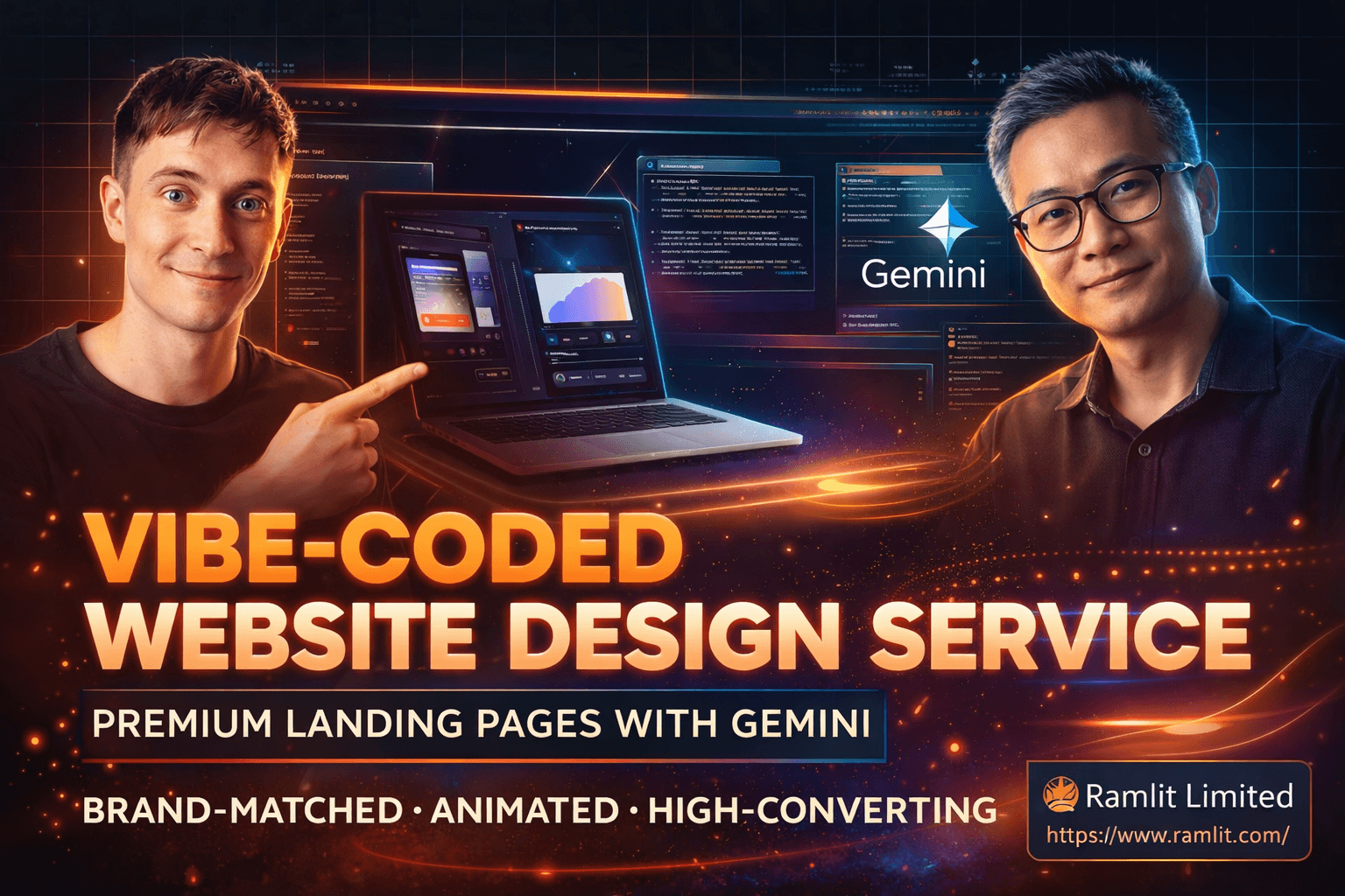

Vibe-Coded Website Design Service: Premium Landing Pages with Gemini (Brand-Matched, Animated, High-Converting)
Over the past year, we’ve seen an explosion of “vibe-coded” apps and websites—fast builds created with AI tools that generate layouts and code in minutes. The speed is real. The opportunity is real.
But let’s be honest about the problem: most of them look terrible.
They’re functional, sure. But they’re generic. Bland typography. Random colors. No brand alignment. No animation polish. And if the site doesn’t feel premium, it won’t sell—whether you’re building your own agency website, launching a SaaS landing page, or delivering client work.
That’s why this topic matters.
In the conversation you shared, Ming—a designer with decades of experience—breaks down a simple truth: AI can build the code, but you still need taste + design direction to get premium outcomes. The “secret sauce” isn’t complicated. It’s just placed at the right spot: references, visual inputs, correct design vocabulary, and the right prompting approach.
This blog post turns those insights into a marketing-ready, service-style guide—so you can sell high-quality websites and landing pages as a premium offer, even if you’re not a traditional designer.
You’ll learn:
- Why vibe-coded websites often look “off”
- The fastest workflow to get premium design results from Gemini-style tools
- The “prompt ingredients” that transform output quality
- How to use references the right way (without copying blindly)
- How to design live with clients and close faster
- A clear service breakdown you can offer (packages, deliverables, process)
- How to price it, position it, and avoid common mistakes
If you run an AI agency, build SaaS products, or sell websites to local businesses, this is the kind of skill that becomes a serious advantage.
Why Vibe-Coded Websites Look Bad (And Why That’s a Massive Opportunity)
AI website generators are improving quickly. But most “vibe-coded” builds still share the same problems:
1) No brand anchoring
If you don’t give AI:
- your brand colors
- typography style
- tone of voice
- examples of what “good” looks like
…it will guess. And guesses usually look generic.
2) Weak hierarchy and typography
AI often produces text that is:
- too large/small in the wrong places
- inconsistent in spacing
- lacking contrast
- using default fonts that don’t match the brand
Typography is not decoration—it’s conversion. If it’s messy, your site feels cheap.
3) Missing “micro-delight” (animations and details)
Most AI-generated sites have:
- basic buttons
- no hover states
- no scroll-based animations
- no “craft” details like glow, blur, progressive overlays
Users may not know design theory, but they feel the difference instantly.
4) No structured section logic
A high-converting landing page is not random blocks of text. It’s a story:
- Hero → social proof → benefits → features → process → pricing → FAQs → CTA
Without this structure, the site won’t convert.
The opportunity: Since most vibe-coded sites look average, anyone who can reliably produce premium design becomes highly valuable—especially for agencies selling websites to businesses that currently have “stink websites.”
The New Standard: Gemini-Quality Output Means Expectations Just Went Up
A key insight from the discussion is that Gemini-level models raise the baseline. This matters because:
- Clients will start seeing more polished AI websites online
- “Good enough” will stop being good enough
- Businesses that still have outdated websites will feel pressure to upgrade
- Agencies that can deliver premium results quickly will win
In other words: the market is shifting from “can you build a website?” to “can you build a website that looks expensive?”
The Core Idea: AI Needs Ingredients, Not Vibes
Ming explains it perfectly with a metaphor:
AI can cook, but you have to give it the ingredients.
Your “ingredients” are:
- a screenshot reference
- a style reference (e.g., “like Linear” or “like Apple”)
- brand colors
- typography direction
- sections you want
- animation direction
- content/manifesto/value proposition
If you provide those inputs, you’ll jump from 0 → 100 very quickly.
If you don’t, you’ll get a website that’s “fine”… but not sellable.
The Service Workflow: From Ugly AI Output to Premium Website in 30–60 Minutes
Here’s the exact workflow turned into a service-style process you can run with clients.
Step 1: Start with a screenshot (fastest improvement)
The simplest upgrade you can make is adding one image reference.
How:
- Take a screenshot of a website you want to emulate (Command + Shift + 4 on Mac, or Snipping Tool on Windows)
- Or screenshot the client’s current site for brand context
- Use the screenshot as a visual anchor in your prompt
This alone improves output drastically because the model picks up:
- layout structure
- spacing
- visual rhythm
- tone (dark mode, minimal, bold, etc.)
Step 2: Bring better inspiration (Mobbin/Dribbble + real sites)
Ming highlights two categories of inspiration:
A) “Real websites” (production sites)
- Apple, Stripe, Linear, SquareSpace, etc.
- These are realistic, conversion-focused, and buildable
B) “Concept websites” (Dribbble-style inspiration)
- More artistic, more premium visuals
- Great for mood boarding and getting clients excited
You want both:
- Real sites for structure + conversion
- Concept designs for premium aesthetics
Step 3: Do a “mood board” live with the client (conversion hack)
This is a secret weapon for selling.
Instead of disappearing for 2 weeks and returning with a surprise design, you:
- browse inspiration live
- ask the client what they like/dislike
- lock in direction quickly
- generate a first draft immediately
This reduces revisions and increases close rate because the client feels involved.
Step 4: Nail the “Hero Section” first (50% of your effort)
The hero section matters most because:
- it’s above the fold
- it sets the entire visual tone
- it becomes the cover image for promos
- it’s the conversion hotspot
A premium hero usually includes:
- strong headline + clear subheadline
- primary CTA + secondary CTA
- product visual/mockup
- social proof (logos or trust signals)
- background design (gradient, glow, grid, noise, etc.)
Step 5: Use the correct vocabulary (this changes everything)
A big gap between beginners and pros is language.
When you use terms like:
- hero section
- bento grid
- split layout (image left, copy right)
- sticky header
- social proof strip
- progressive blur
- glassmorphism / liquid glass
- glow button / beam animation
- scroll-triggered fade-in
- timeline section
- card flip interaction
…AI responds way better, because the prompt becomes precise.
This is “taste + structure” translated into instructions.
Step 6: Add animations intentionally (the premium multiplier)
Most tools default to boring UI unless you request animation.
Examples of premium animations that sell:
- subtle hero intro animation
- scroll fade-in for sections
- hover lift on cards
- glow / beam CTA button
- timeline scroll animation
- card flip interaction
- sticky header blur overlay
Clients may not ask for these explicitly—but when they see them, they perceive craftsmanship.
That perception = higher pricing power.
The Prompt Framework: Copy/Paste “Secret Sauce” Prompt Template
Here’s a professional prompt template you can use (works across many AI builders):
Prompt Template (Design-First)
Goal: Create a high-converting landing page for [Business Name], a [what it does].
Style reference: Inspired by [Linear / Apple / Stripe / Squarespace] and the attached screenshot. Brand: Use [brand colors] (primary, secondary, accent). Typography: [modern sans / geometric / premium serif / mono accents]. Theme: [dark mode / light mode] with [subtle gradients / noise texture / soft glows]. Hero section requirements: headline, subheadline, primary CTA, secondary CTA, product UI mockup, social proof logos. Sections: features (bento grid), testimonials, process, pricing, FAQ, final CTA, footer. Animations: intro hero animation, scroll fade-ins, hover states, glow CTA button, subtle parallax or progressive blur in header. Output: clean HTML/CSS/JS (or framework-ready), responsive, accessible spacing, consistent design system.
This is the difference between “make me a landing page” and “make me a premium landing page.”
Positioning This as a Marketing Service (What You Can Sell)
Now let’s convert this into a service offer you can market.
Service Name Ideas
- Vibe-Coded Website Design (Premium Edition)
- AI Landing Page Design + Build (Brand-Matched + Animated)
- Gemini-Powered High-Converting Website Makeover
- 30-Min Live Website Redesign Session (Vibe Design + AI Build)
Who this service is perfect for
- AI agencies needing a premium website fast
- SaaS founders launching landing pages and MVPs
- local businesses with outdated sites (high-margin upgrades)
- freelancers who want to add a new high-demand offer
- teams needing quick, polished marketing pages
What a Client Gets (Deliverables That Increase Conversion)
Here’s a clean “deliverables” section you can paste into a service page.
✅ You receive:
- 1 premium landing page design + build
- Brand-matched colors + typography
- High-converting structure (hero → proof → features → CTA)
- Polished animations (scroll + hover + CTA effects)
- Responsive layout (mobile/tablet/desktop)
- Copy layout suggestions (headlines, benefit bullets, CTA placement)
- Exported code or deploy-ready page
- Revision round (or live session adjustments)
Optional add-ons:
- Additional pages (about, pricing, contact)
- Full SaaS UI kit / dashboard design
- Brand refresh (palette + type system)
- Performance and SEO setup (metadata, speed optimizations)
Pricing Power: Why Premium Clients Pay $5K–$10K for This
The transcript mentions designers charging $5,000–$10,000 USD for a landing page (traditionally). AI changes production speed, but it does not eliminate value—especially when you deliver:
- brand alignment
- conversion structure
- animation polish
- fast turnaround
- collaborative live session
- high-end visual quality
Premium clients pay for outcomes:
- “This makes us look like a serious company.”
- “This increases conversions.”
- “This saves us weeks of time.”
The Fast Close Strategy: “Live Redesign Session”
One of the smartest marketing moves in the discussion is the live build.
Why it converts so well
- the client sees results instantly
- you reduce revision loops
- you create excitement (“wow, it’s coming together”)
- you can upsell additional pages easily
- it feels like premium consulting, not commodity web design
Simple meeting structure
- 5 min: quick brief (who are you, what do you sell, audience)
- 10 min: mood board + style selection
- 10–20 min: generate + iterate hero section
- 10–20 min: fill key sections and add animations
- 5 min: next steps + deployment + upsell pages
This turns “website design” into a confident, productized service.
Common Mistakes to Avoid (So Your AI Websites Don’t Look Cheap)
Mistake 1: No reference image
Result: generic layout, generic vibe.
Mistake 2: No typography direction
Result: default fonts that look “template-y.”
Mistake 3: No animation request
Result: flat, lifeless UI.
Mistake 4: Too many prompts (wasting money)
Each prompt can cost money (the discussion mentions ~20 cents per prompt in some tools). Iterating inefficiently adds cost and slows you down.
Fix: get direction right first (mood board + hero), then expand.
Mistake 5: Over-designing without conversion structure
Pretty ≠ profitable. Always keep the landing page flow.
FAQs
What’s the difference between vibe coding and vibe designing?
Vibe coding is generating code quickly with AI tools. Vibe designing is guiding the visuals—colors, typography, sections, layout, and animations—so the output looks premium and brand-aligned.
Do I need to be a professional designer to offer this?
You don’t need a traditional design degree, but you do need:
- reference-driven workflows
- design vocabulary
- section structure knowledge
- taste-building through iteration
That’s exactly what this process builds.
How fast can a premium landing page be created?
With the right inputs (brand + references + clear prompt), you can produce a strong first draft quickly—then refine with a few iterations. The “live session” approach makes this even faster.
Can this be used for SaaS dashboards and app UI?
Yes. The same “ingredient” approach applies: layout references, component language, and consistent design systems.
Wrap-Up: Design Is the Differentiator in the Vibe Coding Era
The new reality is simple:
- AI can generate a website fast
- design direction is what makes it sell
If you can reliably produce premium-looking, brand-matched, animated landing pages using modern AI tooling, you’re holding a skill that:
- helps you build your own agency website
- helps you sell websites to clients as a foot-in-the-door offer
- helps you launch SaaS ideas faster
- lets you charge premium rates because the results look premium
And as Gemini-quality output raises expectations, the value of “taste + execution” only goes up.
Let's Work Together
Looking to build AI systems, automate workflows, or scale your tech infrastructure? I'd love to help.
- Fiverr (custom builds & integrations): fiverr.com/s/EgxYmWD
- Portfolio: mejba.me
- Ramlit Limited (enterprise solutions): ramlit.com
- ColorPark (design & branding): colorpark.io
- xCyberSecurity (security services): xcybersecurity.io